Accelerate Success with AI-Powered Test Automation – Smarter, Faster, Flawless
Start free trialAn Important Supplement to Classic Automation
We all know the contribution of classic automation in upscaling the velocity, scale and quality of testing for every build. Automation helps us with the credibility of builds in an agile environment. The QA industry is heavily using automation for test case execution, however there is one major part that always takes a back seat when it comes to automating their test scenarios.

Yes, it is the user interface itself!
A few years ago, we did not have a solution to this problem. We could not test the UX elements for :
- Alignment of images.
- UX distortion on resolution change.
- Shape/size of objects on the web page.
- Visual look and feel on different devices and many more.
In Classic Automation testing, a tool is programmed to carry out regression testing over an application under test. Selenium is one of the most widely used open source tools used for Web-based applications and mobile automation testing. But it does not provide features to validate the UX problems listed above.
Background
After using classic automation for years now and having wonderful tools to test the web & mobile applications, we have some questions to challenge our own work.
- Is Selenium based automation enough to validate the quality of web based application?
- Are we covering the cases for UX like, Is the element correctly aligned on Web page?
- What if my text and background has similar color?
- Does the spacing between elements distort on viewing the page on different resolutions/devices?
- Can dimensions of elements be verified?

These things can be tested manually but in an agile environment, when the sprint is two weeks and rolling out new features take the priority, this validation takes a back seat and is normally done sporadically to save time. In such cases, we can get UX issues sometimes in the latter half of the sprint and sometimes right into production. Fixing them later increases costs and creates a bad user experience.
How about Automating The UI Appearance of Web Application?
When we’re talking about visual testing we want to make sure that the UI itself looks right to the user and that each UI element appears in the right color, shape, position and size. We also want to ensure that it doesn’t hide or overlap any other UI elements. To avoid missing these test cases because of time and effort, we should automate the visual testing and execute it on every build.
We at Webomates Perform Visual Testing Using Galen.
What is Galen?
Galen Framework is a test framework which can be used for testing layout of web-applications in a real browser. It supports both JavaScript and Java-based tests.
It renders the page and validates the layout with Galen specs in all browser configurations.
So, using visual testing with our classic automation we can boost the quality of the product within the same time with an additional small cost.
Why Add Extra Cost for Visual Testing?
My answer to this would be, I do not stop paying the car insurance premium in the hope that nothing will go wrong. Visual Testing like all testing is a software insurance, you realize it’s value when things go wrong visually. Read on for actual examples:
How does Visual Testing Differ from Classic Automation?
| Feature | Visual Testing | Classic Automation |
| Verify the position of the element | ||
| Verify Dimensions of the element | ||
| Verify alignment of the element | ||
| Verification of text, css properties/ visibility of element | ||
| Verification of text on selected images(OCR) | ||
| Image Comparison |
Users can face both functional as well as cosmetic problems in the application which can be difficult for users to achieve their desired end results and this can degrade product quality.
One fine day, I was trying to book a hotel from an online travel application. On selecting the date of the booking, the date picker highlighted a date incremented by 1 whereas input box for date filled exact selected date. Was that a functional issue or a UI issue for selection? Not sure because I moved to another online booking site. In fact, I never returned to that application again.
These kind of scenarios might be small test cases but when missed can cause major hit on the user experience and usage of the application. In the extreme, you can end up losing the customer.
To show the power of visual testing, we are sharing a couple of examples here for reference:

Example 1: Verification of Elements that might not be visible to user because of styling issue
Below is an example of a defect that was caught in the Webomates CQ portal with the help of Visual testing. The Portal displays the total count of test cases executed so far in an application and total number of defects found, as highlighted in the snapshot below.
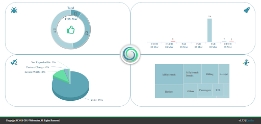
The text “98,239 test cases executed and 681 defects found by Webomates” was supposed to be visible at the bottom of the dashboard page as shown in Image-1a but this text was actually missing as shown in Image-1b. The issue was that the color of this text was similar to the background color. So although selenium automation passed the test case as it verified the presence of the text on the UI. However Galen failed the test case because visually the text was not visible.
Image-1a
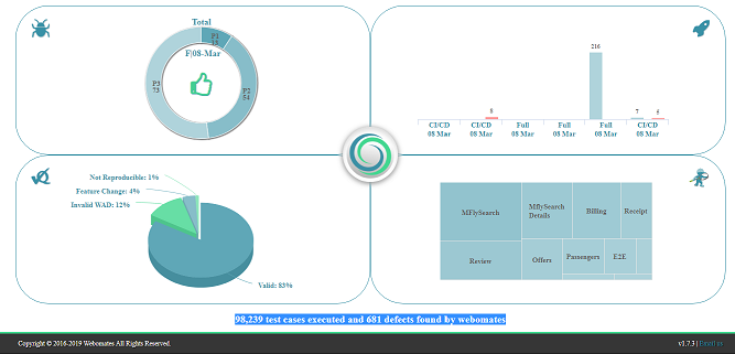
Image-1b
Example 2: Verification of alignment of the elements
Here is another example. Webomates is known for identifying critical defects that save millions of dollars for our customers. Customers acknowledge Webomates work by marking those defects as WOW defects. The WOW defects’ monthly count is shown within the victory cup adjacent to Webomates logo at the top left corner as shown in Image-2a.
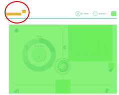
Selenium failed to catch the alignment issue the of victory cup. On other hand Galen helped us to catch this issue that occurred in tablet view. The heat map for corresponding Galen test is shown in below Image-2b.
Image-2a
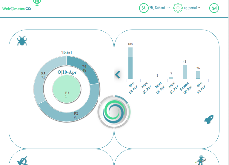
Image-2b
Example 3: Verification of UI on different browser resolution and devices
We are in a world where devices with multiple resolutions and configurations are available, to reach the maximum user base the application needs to be compliant with different devices and at all resolutions.
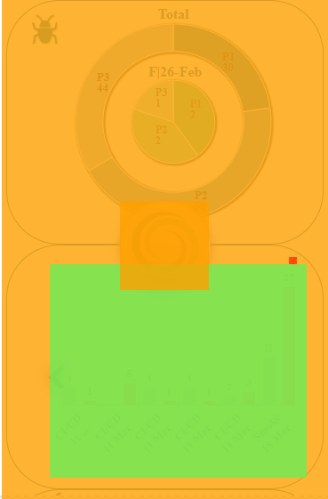
At the time of any build deployment, if we need to verify on each device and resolution combination, it will be a huge cost and effort. So, in such cases, automation helps. Classic automation testing will only check the element presence and the application functionality but the end user may face difficulties due to the distorted UI. In below image-3a the UI is distorted on mobile view. These defects are again caught with visual testing as depicted in Galen generated heat map (image-3b).
Image-3a
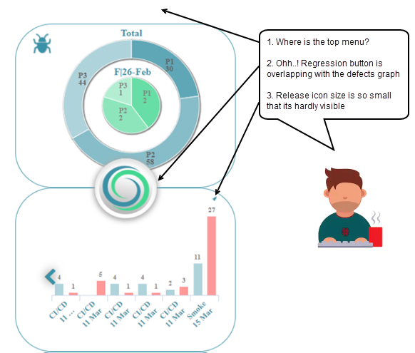
Image-3b
Conclusion
Visual testing is an important tool that should be added to the arsenal of tests and carried out on a software release prior to it being pushed into production. With the multitude of devices and resolutions that your website or mobile application needs to support, it is imperative that scenarios in which features are unavailable, text is not visible or the layout of the application is deformed or obstructed must be validated for each software build.
Visual testing with Galen is an effective method to address these issues. Or you can just add visual test cases to your test case list with WebomatesCQ service or if you have not subscribed yet try it out in our FREE TRIAL for three months! It takes 2 minutes to register, and an hour or so to become operational.
An important supplement to classic automation
We all know the contribution of classic automation in upscaling the velocity, scale and quality of testing for every build. Automation helps us with the credibility of builds in an agile environment. The QA industry is heavily using automation for test case execution, however there is one major part that always takes a back seat when it comes to automating their test scenarios.
Yes, it is the user interface itself!
A few years ago, we did not have a solution to this problem. We could not test the UX elements for :
- Alignment of images.
- UX distortion on resolution change.
- Shape/size of objects on the web page.
- Visual look and feel on different devices and many more.
In Classic Automation testing, a tool is programmed to carry out regression testing over an application under test. Selenium is one of the most widely used open source tools used for Web-based applications and mobile automation testing. But it does not provide features to validate the UX problems listed above.
Background
After using classic automation for years now and having wonderful tools to test the web & mobile applications, we have some questions to challenge our own work.
- Is Selenium based automation enough to validate the quality of web based application?
- Are we covering the cases for UX like, Is the element correctly aligned on Web page?
- What if my text and background has similar color?
- Does the spacing between elements distort on viewing the page on different resolutions/devices?
- Can dimensions of elements be verified?
These things can be tested manually but in an agile environment, when the sprint is two weeks and rolling out new features take the priority, this validation takes a back seat and is normally done sporadically to save time. In such cases, we can get UX issues sometimes in the latter half of the sprint and sometimes right into production. Fixing them later increases costs and creates a bad user experience.
How about automating the UI appearance of web application?
When we’re talking about visual testing we want to make sure that the UI itself looks right to the user and that each UI element appears in the right color, shape, position and size. We also want to ensure that it doesn’t hide or overlap any other UI elements. To avoid missing these test cases because of time and effort, we should automate the visual testing and execute it on every build.
We at Webomates perform Visual testing using Galen.
What is Galen?
Galen Framework is a test framework which can be used for testing layout of web-applications in a real browser. It supports both JavaScript and Java-based tests.
It renders the page and validates the layout with Galen specs in all browser configurations.
So, using visual testing with our classic automation we can boost the quality of the product within the same time with an additional small cost.
Why add extra cost for Visual Testing?
My answer to this would be, I do not stop paying the car insurance premium in the hope that nothing will go wrong. Visual Testing like all testing is a software insurance, you realize it’s value when things go wrong visually. Read on for actual examples:
How does Visual Testing differ from Classic Automation?
| Feature | Visual Testing | Classic Automation |
| Verify the position of the element | ||
| Verify Dimensions of the element | ||
| Verify alignment of the element | ||
| Verification of text, css properties/ visibility of element | ||
| Verification of text on selected images(OCR) | ||
| Image Comparison |
Users can face both functional as well as cosmetic problems in the application which can be difficult for users to achieve their desired end results and this can degrade product quality.
One fine day, I was trying to book a hotel from an online travel application. On selecting the date of the booking, the date picker highlighted a date incremented by 1 whereas input box for date filled exact selected date. Was that a functional issue or a UI issue for selection? Not sure because I moved to another online booking site. In fact, I never returned to that application again.
These kind of scenarios might be small test cases but when missed can cause major hit on the user experience and usage of the application. In the extreme, you can end up losing the customer.
To show the power of visual testing, we are sharing a couple of examples here for reference:
Example 1: Verification of Elements that might not be visible to user because of styling issue
Below is an example of a defect that was caught in the Webomates CQ portal with the help of Visual testing. The Portal displays the total count of test cases executed so far in an application and total number of defects found, as highlighted in the snapshot below.
The text “98,239 test cases executed and 681 defects found by Webomates” was supposed to be visible at the bottom of the dashboard page as shown in Image-1a but this text was actually missing as shown in Image-1b. The issue was that the color of this text was similar to the background color. So although selenium automation passed the test case as it verified the presence of the text on the UI. However Galen failed the test case because visually the text was not visible.
Image-1a

Image-1b

Example 2: Verification of alignment of the elements
Here is another example. Webomates is known for identifying critical defects that save millions of dollars for our customers. Customers acknowledge Webomates work by marking those defects as WOW defects. The WOW defects’ monthly count is shown within the victory cup adjacent to Webomates logo at the top left corner as shown in Image-2a.Selenium failed to catch the alignment issue the of victory cup. On other hand Galen helped us to catch this issue that occurred in tablet view. The heat map for corresponding Galen test is shown in below Image-2b.
Image-2a

Image-2b

Example 3: Verification of UI on different browser resolution and devices
We are in a world where devices with multiple resolutions and configurations are available, to reach the maximum user base the application needs to be compliant with different devices and at all resolutions.
At the time of any build deployment, if we need to verify on each device and resolution combination, it will be a huge cost and effort. So, in such cases, automation helps. Classic automation testing will only check the element presence and the application functionality but the end user may face difficulties due to the distorted UI. In below image-3a the UI is distorted on mobile view. These defects are again caught with visual testing as depicted in Galen generated heat map (image-3b).
Image-3a

Image-3b

Conclusion
Visual testing is an important tool that should be added to the arsenal of tests and carried out on a software release prior to it being pushed into production. With the multitude of devices and resolutions that your website or mobile application needs to support, it is imperative that scenarios in which features are unavailable, text is not visible or the layout of the application is deformed or obstructed must be validated for each software build.Visual testing with Galen is an effective method to address these issues. Or you can just add visual test cases to your test case list with WebomatesCQ service or if you have not subscribed yet try it out in our FREE TRIAL for three months! It takes 2 minutes to register, and an hour or so to become operational.
Tags: Galen, Software Testing, Visual Testing



Leave a Reply